WANDAVISION
Main Titles - Direction + Design + Animation
Parody Titles - Direction + Design + Animation
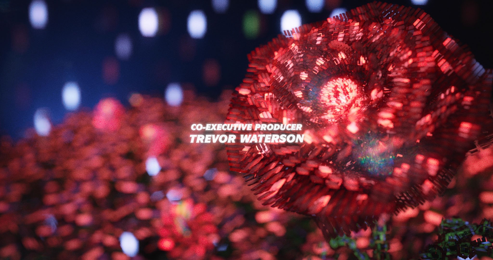
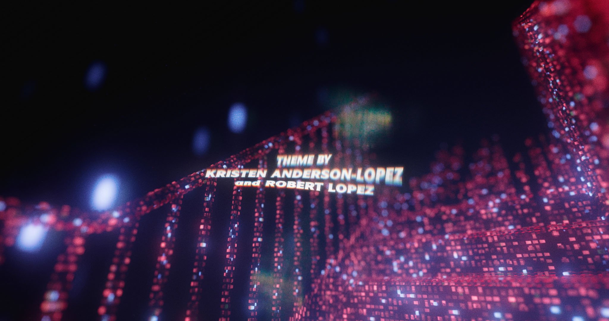
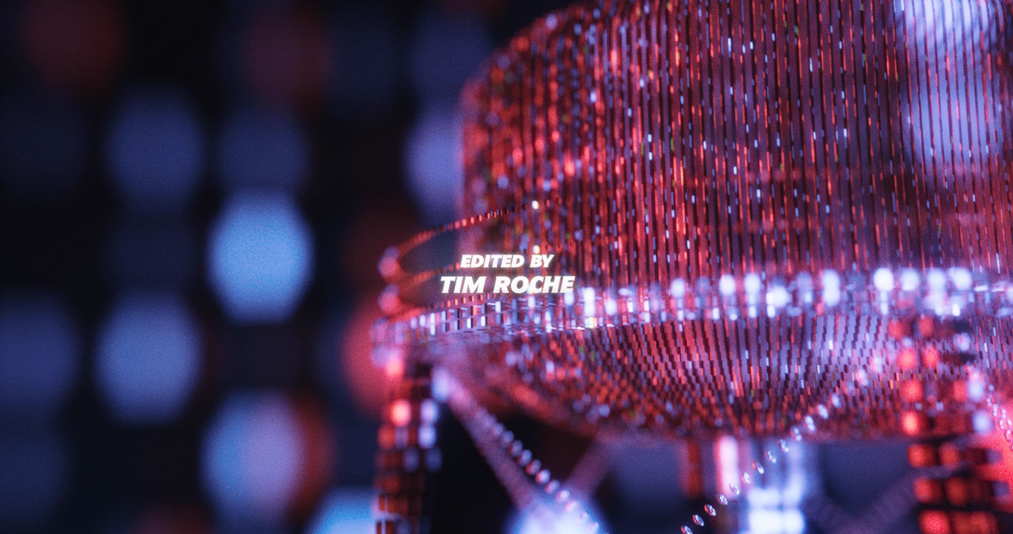
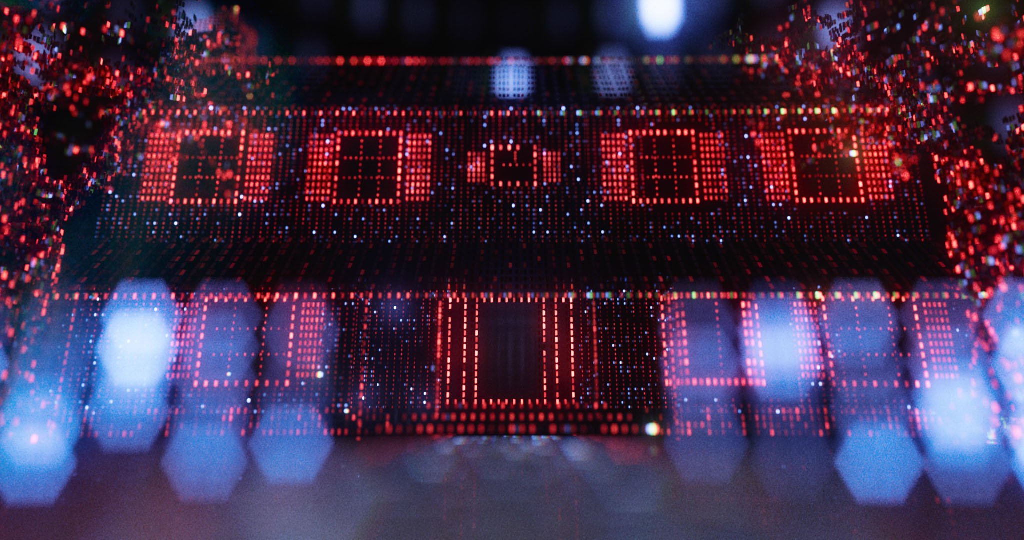
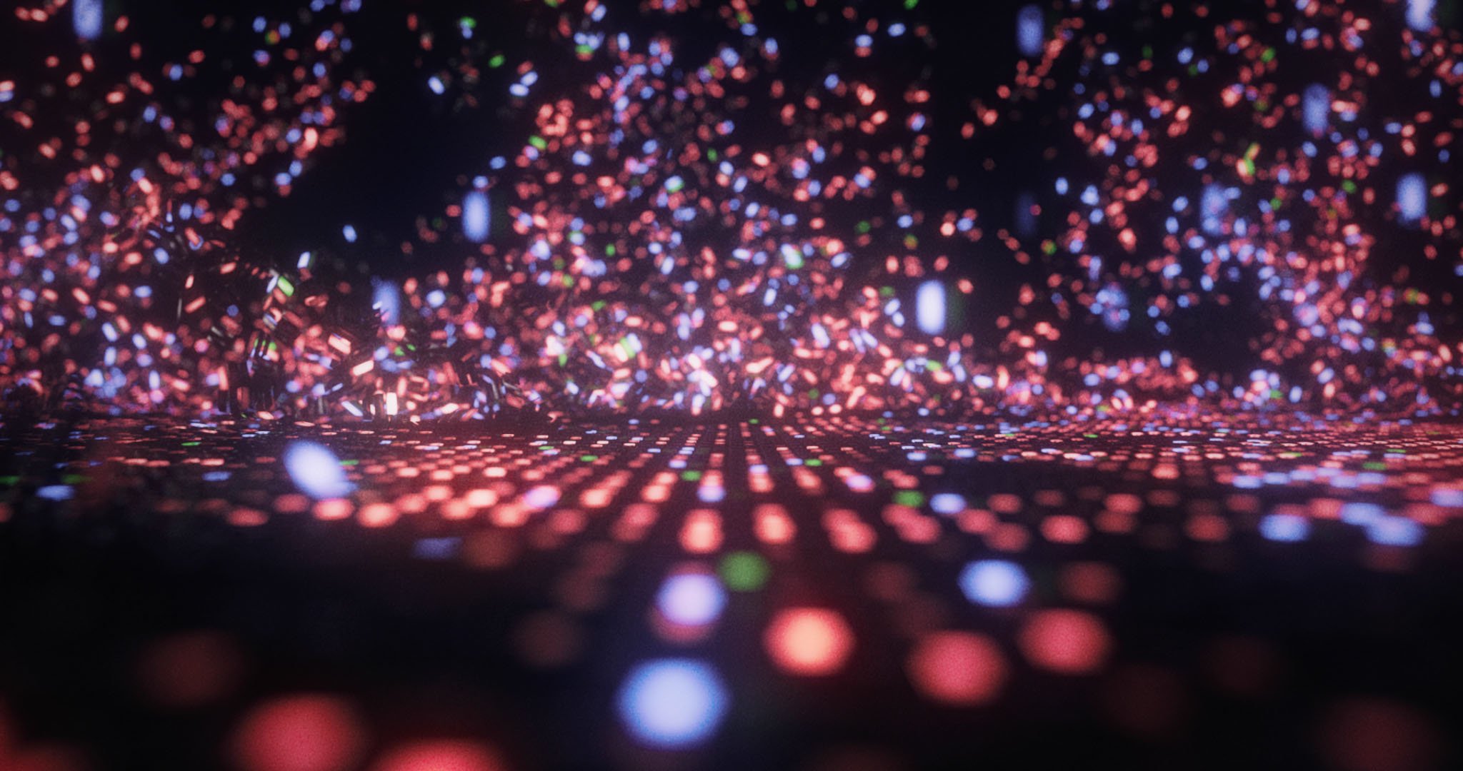
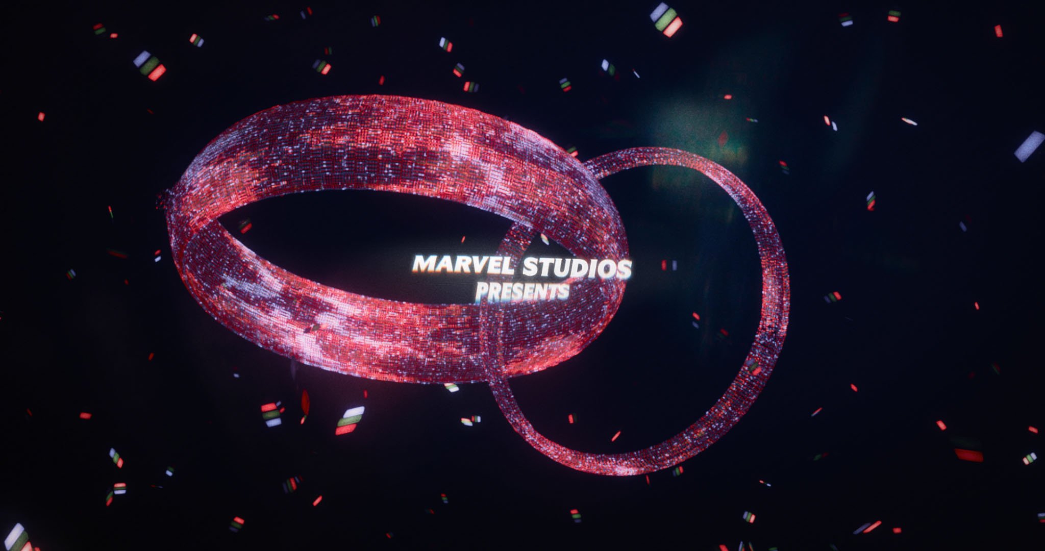
WandaVision marked a milestone for us at Perception as our very first title sequence created entirely from home during quarantine—from concept to final execution, the entire project was done remotely. This sequence was a dream project for me, blending my love for classic and contemporary sitcoms with the world of the Marvel Cinematic Universe.
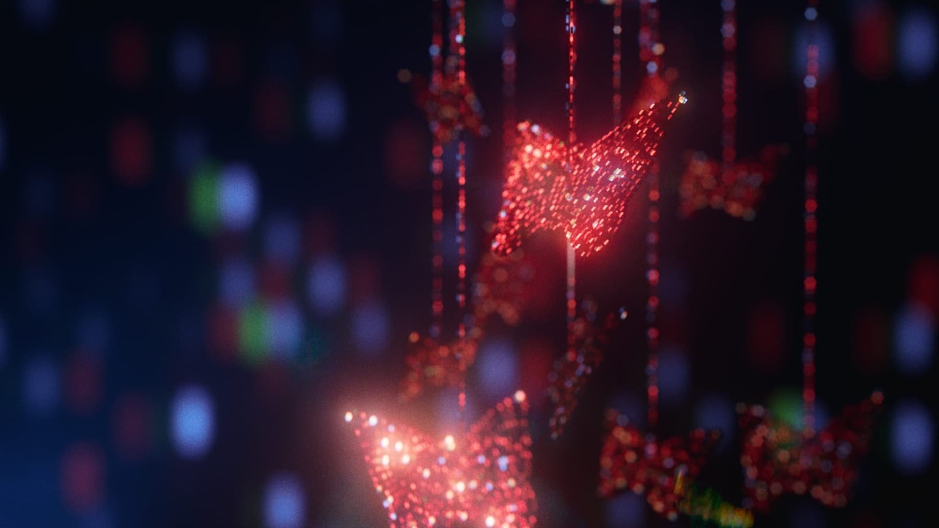
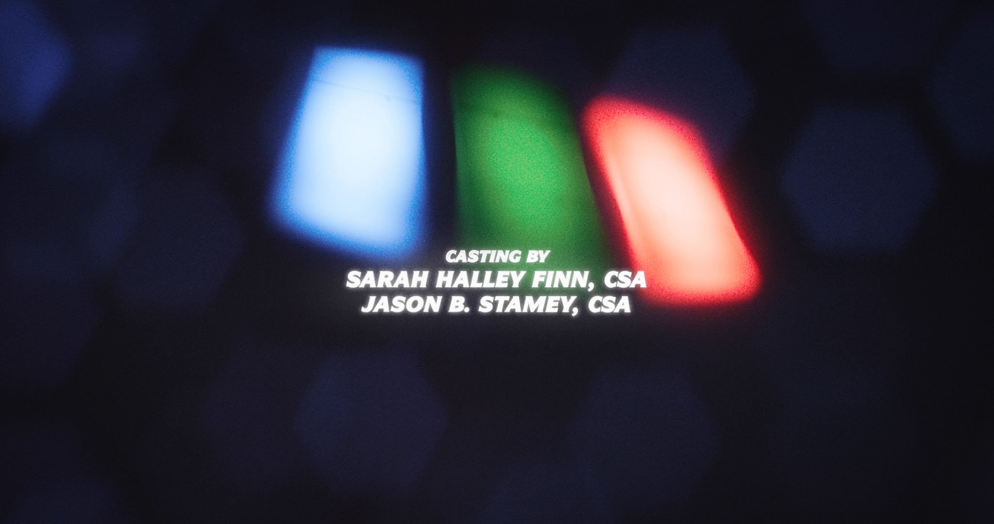
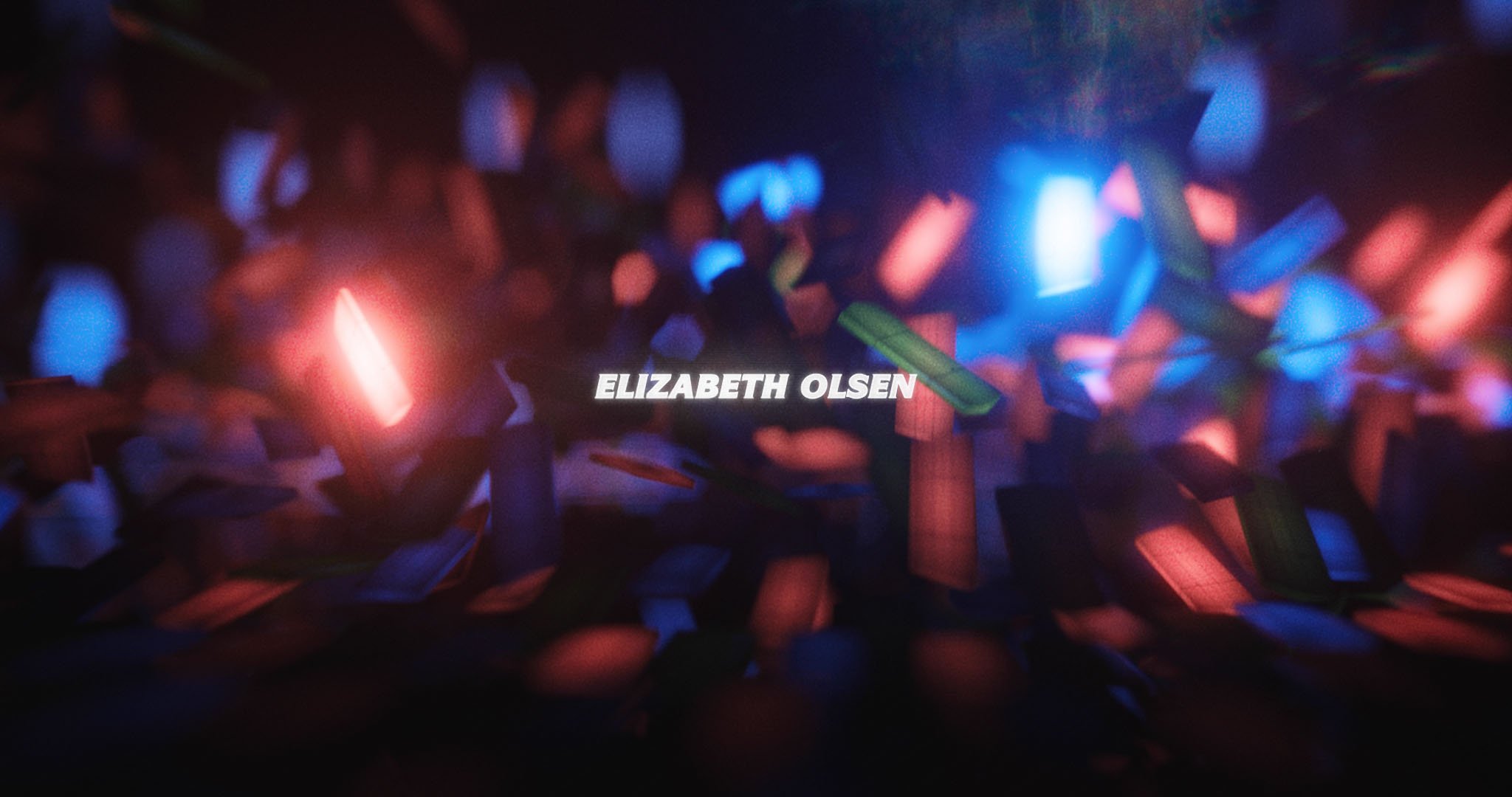
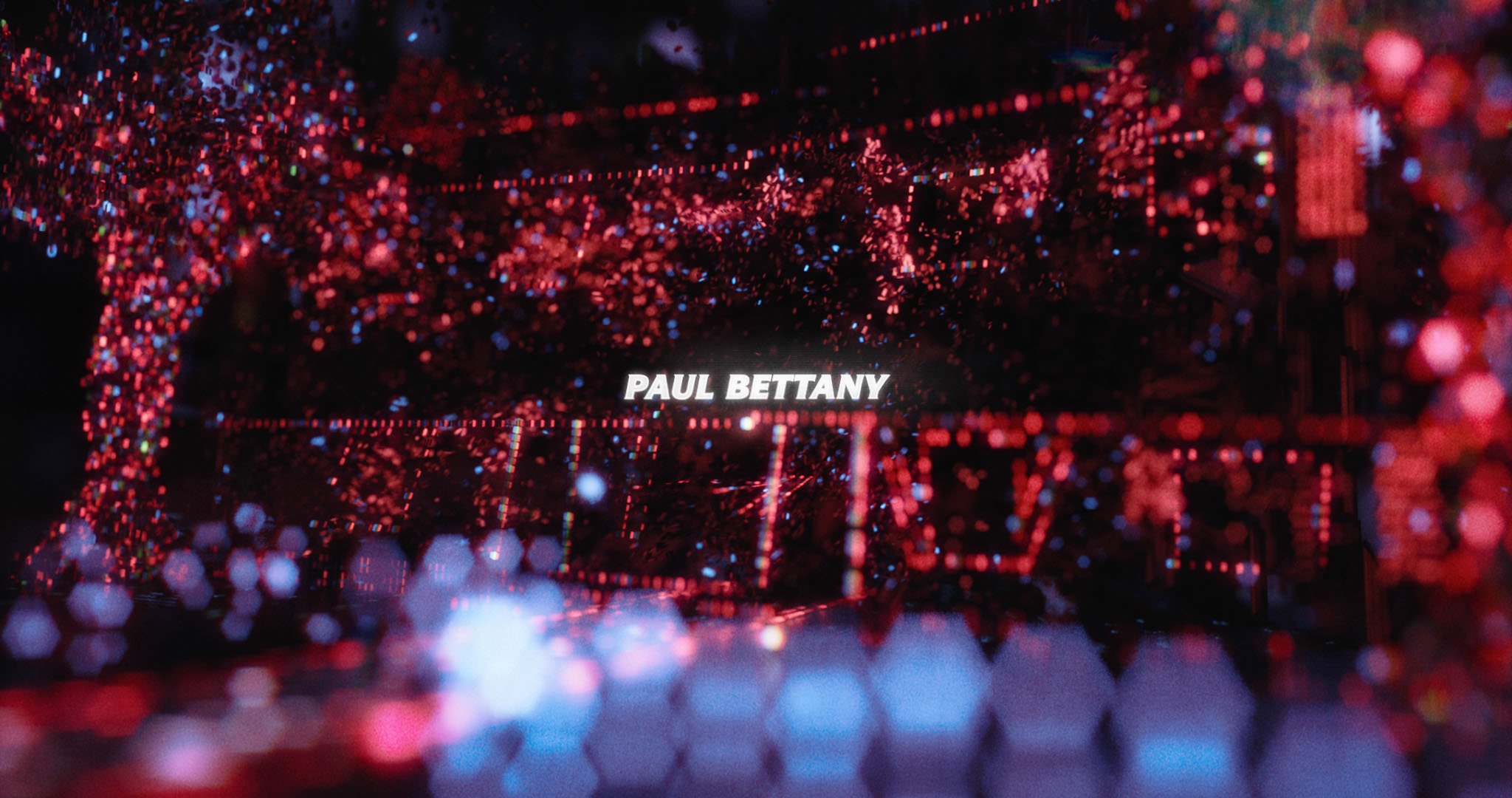
When Marvel approached us, one of the initial directions from Director Matt Shakman was to remind audiences that this was still a Marvel project—Marvel’s first TV show, with all eyes on it, wasn’t a giant superhero extravaganza. It was a unique blend of deep mystery and themes of grief. Our goal was to make a big, glossy sequence that infused subtle story cues into the gorgeous visuals with hints viewers might only fully grasp after watching the whole series (no spoilers here!).
Alongside the main titles, we also crafted a series of in-universe parody titles for each episode, each tailored to emulate iconic sitcoms like The Dick Van Dyke Show, The Munsters, and Malcolm in the Middle. These sequences required extensive research which included mostly watching a lot of TV. No one ever said this job was easy!
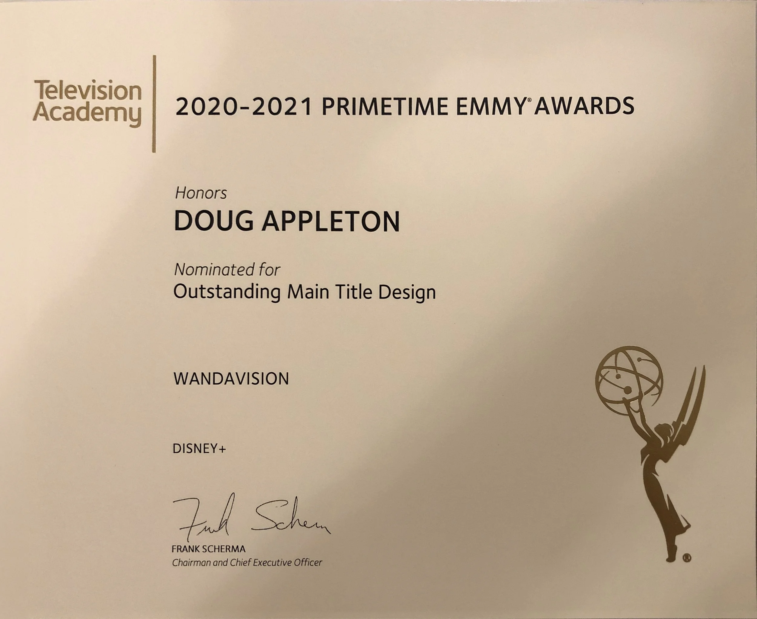
For all our hard work, the team at Perception was honored with an Emmy nomination for Outstanding Main Title Design. This recognition was an unexpected and humbling conclusion to a project that already held great significance for us. I am immensely proud of this project and the talented team that brought it to life.
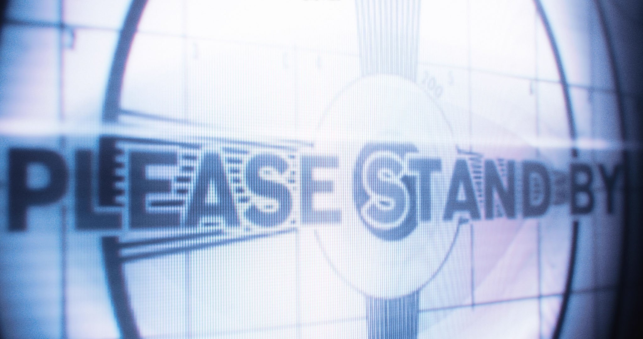
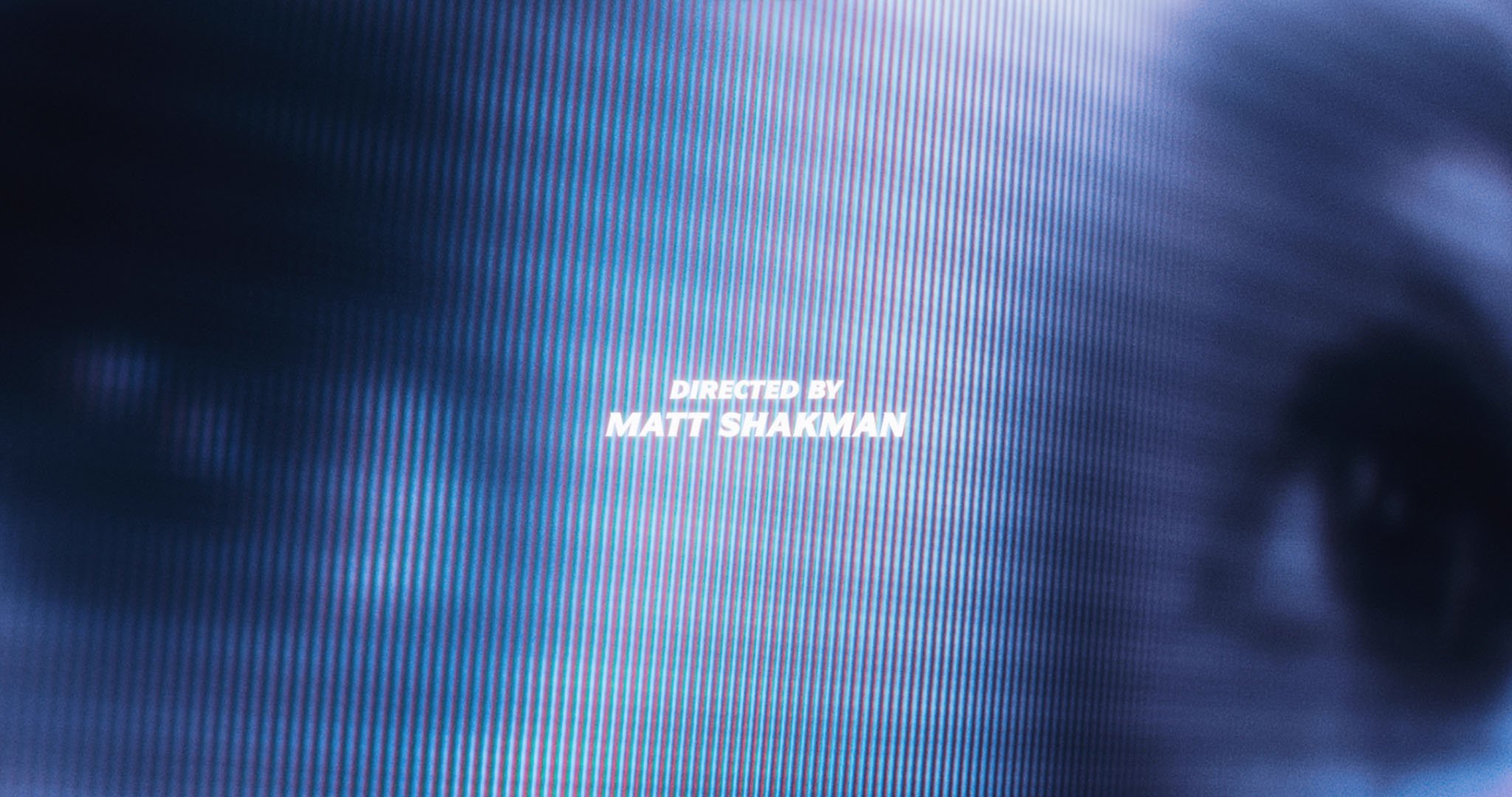
A behind-the-scenes look at the entire process.
